This is part two of my previous article titled, "Business Intelligence With Excel PivotTable, PivotChart & PowerPivot (Part 1)" In this article I will discuss more advanced PowerPivot features for Excel.
PowerPivot offers features that provide a way for business users to access and analyze business intelligence data more easily. For example, users can use PowerPivot to create hierarchies that provide complex data-grouping capabilities. Also, advanced PowerPivot users can create Perspectives that make it easier to work with large tables. These are just two of several features that make PowerPivot a powerful tool for business intelligence professionals and Excel users.
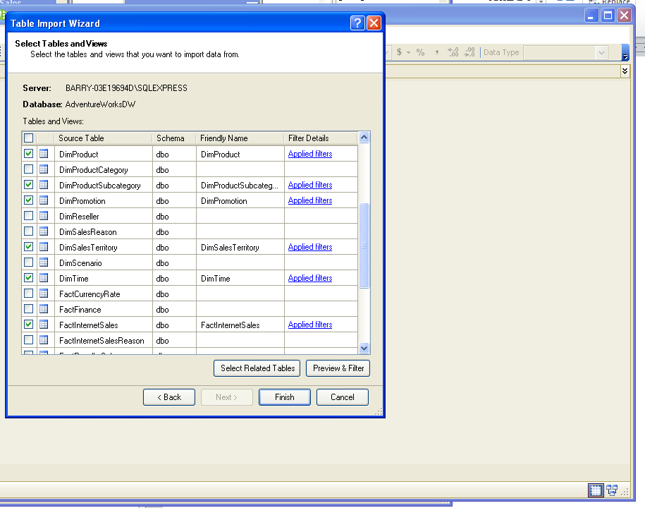
PowerPrivot provides a way to access business intelligence data from a variety of sources, as discussed in my previous article "Business Intelligence With Excel PivotTable, PivotChart & PowerPivot (Part 1)". However, for the purpose of this article I am going to discuss using PowerPivot to access a data warehouse in SQL Server. In this example I use PowerPivot to create a connection to AdventureWorksDW. I also create a SQL Server connection and select the following tables to access the same data I used in Part 1 of this article: DimProductSubcategory, DimProduct, DimSalesTerritory, FactInternetSales, DimPromotion, DimTime.
When you first access PowerPivot you are presented with a blank window that has a menu. To begin you select File and use any of the "Get External Data" options that meet your needs. For the purpose of this article I selected "Get External Data From Database" and then I selected "From SQL Server" as the data source.
As you step through PowerPivot's Table Import (or other) Wizard you are presented with options that help you build a connection that would, otherwise, require technical skills. If you connect to a data warehouse in SQL Server PowerPivot provides the ability to select the tables you want to work with. In addition, you can specify the table columns that contain the data you need. This is useful because you don't have to import all columns into PowerPivot. Instead, you can specify the columns for a table while using the Select Tables and Views window shown below. To begin you select a table and then click the Preview & Filter button to access a window that lets you specify that table columns to include.
The Preview Selected Table window, shown below, displays all of the columns for the selected table. By default all columns that makeup the table are selected. You can deselect ALL table columns by clicking the button highlighted below with an arrow. You can then select the desired table columns. This approach is useful for tables that may have numerous columns; but you only want to select two or three columns. Note that if all table columns are deselected you can click the button, shown below, to select all columns.

When you work with a SQL Server database there are four types of Key columns you will encounter:
As previously mentioned two of the tables I use are DimProductSubcategory and DimProduct. The DimProduct table maintains a list of products. The DimProductSubcategory table includes a list of subcategories for the products. To relate the DimProduct table and the DimProductSubcategory table the Primary Key from the DimProductSubcategory table is added to the DimProduct table. The ProductSubCategoryID is a Foreign Key column, in the DimProduct table, because it belongs to the DimProductSubcategory table. But, it is is placed in the DimProduct table to relate the DimProduct table to the DimProductSubCategory table; and, ultimately relate each product to a subcategory. As the database displays a product the Foreign Key column, in this example, allows the database to also display the Subcategory for each product.
Once the desired tables (and columns) have been selected users can click the OK button to close the Preview Selected Table window. The Select Tables and Views window becomes visible again.
Note that when you select the columns you want to work with keep in my that you will need to maintain the relationship between tables when you work with data stored in multiple related tables. If you select the Primary and Foreign Key columns, PowerPivot will create the relationships (between tables) for you. When you click the Finish button on the Select Tables and Views window, PowerPivot processes the tables and columns. When the processing is completed a "Success" message is displayed.

You can click the Details link (shown above) to see additional information about the actions PowerPivot has performed based on the columns you selected. In my example, I selected the Primary Keys and Foreign Keys to ensure PowerPivot built a relationship between my selected tables (as shown in the Details window below).

Once PowerPivot displays the "Success" message you can close the Table Import Wizard and start to work with the data. You can then use PowerPivot to prepare you data for analysis.
Just one quick note. If you did not select the Primary (or Alternate) Key columns and Foreign Key columns when you selected the tables you can still create relationships among the tables. From within PowerPivot select Table -> Relationships -> Create Relationships to access the Create Relationship window (shown below). You can then select the tables and Key columns used to relate the tables.

Also you can select Table -> Relationships -> Manage Relationships to open the Manage Relationships window. The Manage Relationships window shows a list of table relationships that exist. To edit a relationship select a relationship and then click the Edit button to display the Edit Relationship window (which looks like the Create Relationship window shown above). You can then edit relationships between tables by selecting a different Primary (or Alternate) Key column and/or Foreign Key column.
In PowerPivot for Excel the Primary (or Alternate) Key is called Column. The Foreign Key is referred to as the Related Lookup Column.
PowerPivot provides a way to create measures from standard aggregations such as sum, avg (average), count, min, max, etc. To create custom measures (or expressions) in PowerPivot you use a Data Analysis Expression (DAX).
PowerPivot formulas provides a way for you to add measures as well as calculated columns. To do this you use Data Analysis Expressions (DAX). DAX formulas start with an equal sign followed by the function name or expression. You also add any values required by the expression. With DAX you can perform basic or complex calculations; and, your calculations can be based on numbers, string values, date/time values, etc.
Although DAX is similar to Excel formulas they differ in a few ways. For example, a DAX function always references a complete column or a table. And, if you want to only use specific values from a table or column, you can add filters to the formula.With DAX you can also write functions that return a table as its result; and, then feed the results to other functions.
In PowerPivot you can create calculated columns that return a numeric, text or other value. In my example I created a calculated column that returns a string. My calculated column joins the customer’s First Name column and Last Name column into one column. To do this I create a DAX Function.

Notice, in the picture above, when I select a function PowerPivot shows me the values the function requires. In programming a function returns a value. In this example I'm using the Concatenate function to return the customer's First and Last Name with a comma and space between the two. Since I want to concatenate the DimCustomer FirstName and LastName columns I can locate the columns by typing a "D" for DimCustomer where Text1 goes.

PowerPivot automatically displays a list of available values that start with "D". I can select my columns based on how I want the customer’s name to display. If I want the customer’s last name then first name I would select DimCustomer[LastName] first. I can type a comma to tell PowerPivot I want to add the second value the function expects.

I can rename the column by simply right-clicking the calculated column and selecting Rename Column. I am then able to give the column a more meaningful name.

Now from within PowerPivot I can select View -> PivotTable. The Create PivotTable displays. I can create a new Excel workbook; or, create the Pivot Table in the existing workbook as discussed later in this article. You can read more about DAX by reading the DAX Overview article located at http://technet.microsoft.com/en-us/library/gg399181.aspx.
As previously mentioned in addition to creating calculated columns you can use DAX to create measures. By default, PowerPivot is set to automatically create some standard measures for you. However, you can manually create a measure using the following syntax: <measurename>:<formula> where <measure> is the name you want to give the measure; and, <formula> is the DAX.When you create a measure by entering a DAX, as shown in the following picture, the measure is added to the calculation area.

Alternatively, you can create your PivotTable (in Excel) and create measures from there. To do so you right-click a table. You can then select Add New Measure from the menu that displays (as shown below).

The Measure Settings window displays. You can then add a name for your measure and use the Formula button to add a formula and even check your formula.

You can learn more about PowerPivot measures by reading the article title Measures in PowerPivot at http://technet.microsoft.com/en-us/library/gg399077.aspx. You can also learn more about creating measures and follow the instructions to create a similar example shown in this article by visiting the following http://technet.microsoft.com/en-us/library/gg399161.aspx .
Within PowerPivot Organizations can create Key Performance Indicators (also called KPIs) to support their performance measurement program. Performance measurement enables companies to better compete by becoming the best at what they do. For example, Company A might specialize in software development. Company B, an unknown company, would compare its processes and performance against the processes, techniques, etc. used by Company A. Company B can then use the information it learned about Company A to set targets and standards to also become counted among the best. Company B continually monitors its data and targets and executes process improvement measures to, ultimately, become the best too. In a different scenario, a member of the executive team may set goals and targets that the company must meet.
Although the most commonly used KPIs are sales related; there are many other types of KPIs. For example, there are performance KPIs One example of a performance KPI might be as follows: Achieve a 98% customer satisfaction rating in Technical Support. A company that sets this KPI would provide customers access to an online Technical Support survey and then capture the survey results. The company then tracks and manages customer responses to the survey. The results are then compared to the KPI, complaints are noted, processes are improved, as necessary, until the company reaches its KPI target.
A KPI typically indicates a single goal or target for a company. People within the organization than continually view data and manage related processes to improve performance. PowerPivot provides a way for users to create and manage KPIs. In PowerPivot KPIs are created from a base measure that evaluates to value. You can then build the KPI from the base measure, as shown in the paragraphs below.
Note: To create a KPI you must work with measures, which are displayed in the Calculation Area. If the Calculation Area is not visible select View -> Model View -> Show Calculation Area (as shown below).

To begin right-click the measure from which you want to create the KPI. Select Create KPI.

The Key Performance Indicator window displays, as shown below.

Select the Measure, from the Measure drop-down, that the KPI will extend. As previously mentioned a key element about a KPI is that it provides a way to easily track a company's (or department's) progress in meeting a goal. KPIs use color-coded icons so viewers can easily determine the status of a KPI. PowerPivot provides a way to define status thresholds so the colors that icons display provide meaningful information based on what a company decides the KPI is showing:
To define what color a KPI shows (based on the measure value associated with the KPI) PowerPivot uses low and high threshold values. For example, if the KPI icon should display red if measure value associated with the KPI is 34% below the target; then the KPI low threshold value should be set to 34%. If the KPI icon should display green when the measure value is 98% within the target--then the high threshold value is changed from 80% to 98%. Any value between the low threshold and high threshold causes the KPI icon to display yellow.

In the Select icon style section you select the icons you want the KPI to display to reflect the status. Below, PowerPivot shows a measure that has been extended by a KPI.

Once you create the PivotTable you can select the KPI. The following picture shows a single icon displaying the value, status and target. Notice how, at a glance, an executive or other employee can tell whether or not the organization has met its target. Also notice that the PowerPivot Field List also notes the KPI with the icon that makes it easy to spot.

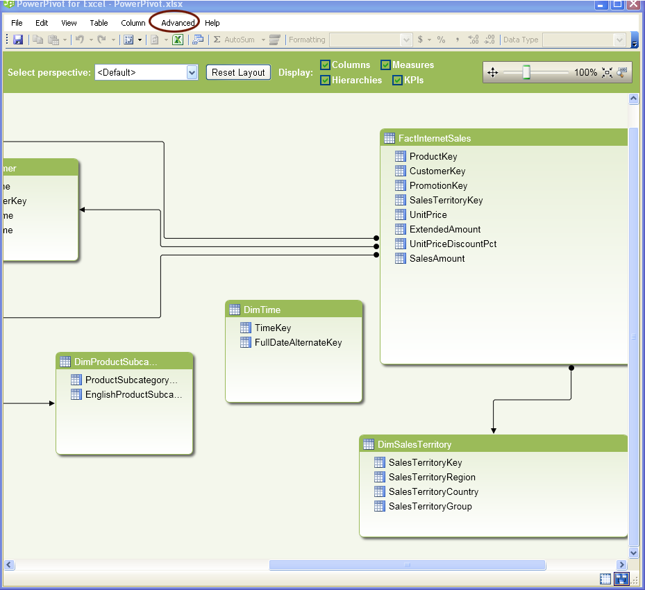
Hierarchies enable you to select columns within a table and organize those columns in a hierarchical way. To create a hierarchy you must be in Design view. One way to navigate to design view is to select View -> Model View -> Diagram View. You can then right click on the table that contains the columns for which you want to create a hierarchy and select Create Hierarchy.

By default the first Hierarchy created is called Hierarchy 1. Select Rename to change the name of the hierarchy (as shown below). You can use the Move Up/Move Down options to change the order of the columns in the hierarchy.

When you view the PowerPivot Field List you will notice that your hierarchy appears along with the table columns.(In my example I created the Hierarchy under the DimSalesTerritory table so that is where I go to find the Hierarchy I created.)

The associated data is automatically added to the applicable group. The following picture shows my example. On the right side of the picture I highlighted (using a partial red box) the hierarchy I created called Sales Regions. The left side of the picture shows the hierarchy added to the PivotTable. Notice the territories are grouped so the user can drill-down by expanding each group, which is highlighted using a complete red box. I added SalesTerritoryGroup as the parent in the hierarchy. I then added SalesTerritoryCountry and lastly I added SalesTerritoryRegion, which is the lowest level in the group. I renamed the items in the hierarchy to omit the "SalesTerritory" prefix. I then clicked Sales Amount to add a measure to the PivotTable.

A perspective provides a way for users to create a View of the data. For example, someone with more advanced PowerPivot skills may create perspectives so that less experienced business users can use PowerPivot for analysis. However, instead of finding columns and filtering unwanted columns a perspective can be created to include the tables and columns a group of business users would want to use. To create a perspective you must first switch to diagram mode. Then you have to switch to advanced mode by selecting File -> Switch to Advanced Mode. (Make sure you select the Primary key and Foreign keys to maintain relationships within the perspective.)
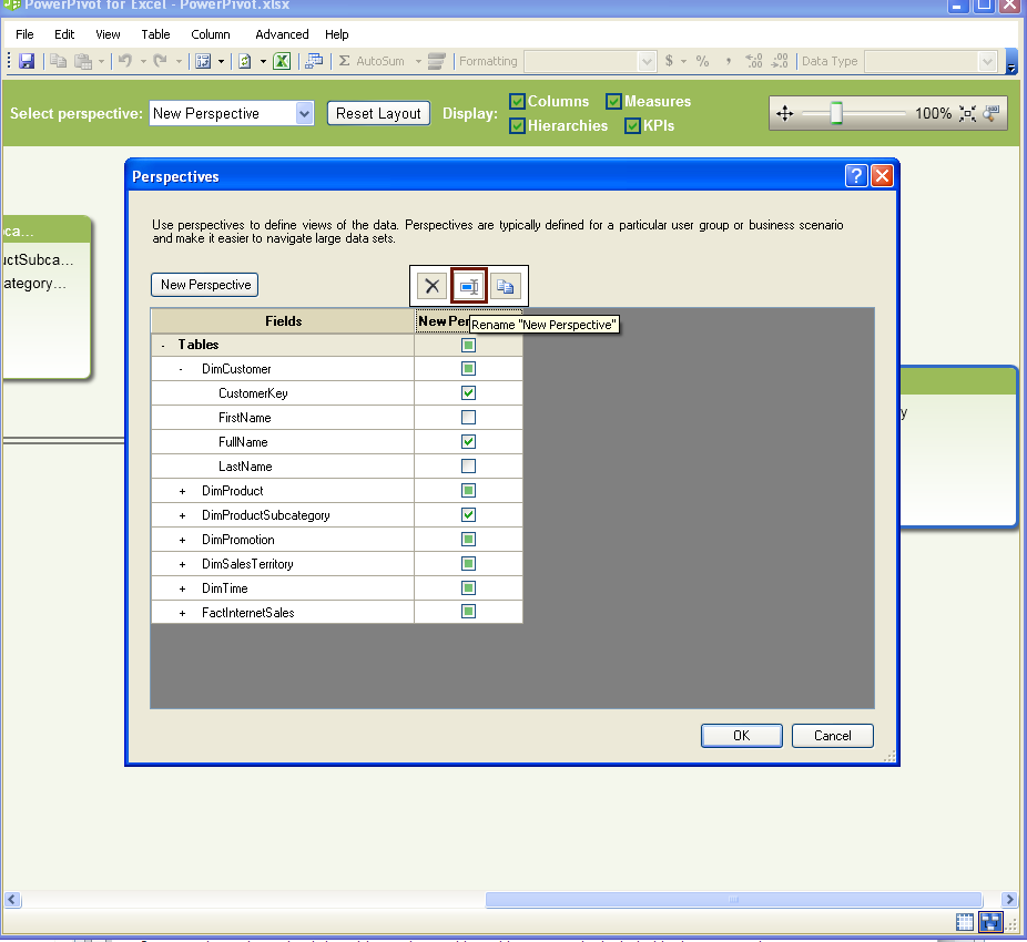
Once you have determined the tables, columns, hierarchies, etc. to be included in the perspective you can select Advanced -> Perspectives. The Perspectives window (shown in the picture below) displays. You can then select the New Perspective button and select the objects to be included in the perspective. Notice table columns, calculated columns and hierarchies are all available and can be included in a perspective. By default the perspective is called New Perspective. Click the Rename "New Perspective button. You can then change the default New Perspective name.
Once you have created a perspective you can select the perspective using the Select perspective drop-down. Creating a perspective makes it easier to find table and column data when creating a PivotTable. As shown in the following picture, you can select a Perspective and use the objects in the Perspective to populate your PivotTable. When you use this approach you have to view the tables and columns associated with the Perspective regardless of the number of tables and columns saved in PowerPivot.

If you determine that you need to add more tables and columns to PowerPivot you can do so by selecting Table -> Existing Connections to open the Existing Connections window you used to initially add the tables and columns. Select the connection you previously used then click the Open button to access the Table Import Wizard. You then follow the steps you previously followed to add tables and filter columns.

Once you have created all of the components you need to analyze the data you can create a PivotTable. From within PowerPivot you can select View -> PivotTable, or PivotChart, or Table and Chart, etc.

If I select View -> PivotTable, PowerPivot opens Excel (if it isn't already launched) and provides the options needed to build a PivotTable. The PivotTable created using PowerPivot looks like the PivotTable created using out-of-the-box Excel--except you have more options. For example, you can use the Perspectives and Hierarchies you created to populate your PivotTable. To create your PivotTable you either select values from the PowerPivot Field List; or, you can drag and drop fields from the List. You can remove selected options from the PivotTable by deselecting them in the PowerPivot Field List.
Within Excel you can also create slicers by moving values to the slicers horizontal or slicers vertical field. Slicers enable users to easily filter data. In the example my vertical slicers displays Regions and my horizontal slicer displays customers. When I click a Region, only the customers associated with the region displays in the horizontal slicer. I can then click on a customer to view the products the customer purchased and the amounts of the purchase. This approach provides users with a way to quickly and easily filter data.


PowerPivot offers features that provide a way for business users to access and analyze business intelligence data more easily. For example, users can use PowerPivot to create hierarchies that provide complex data-grouping capabilities. Also, advanced PowerPivot users can create Perspectives that make it easier to work with large tables. These are just two of several features that make PowerPivot a powerful tool for business intelligence professionals and Excel users.
Accessing Data From Within PowerPivot
PowerPrivot provides a way to access business intelligence data from a variety of sources, as discussed in my previous article "Business Intelligence With Excel PivotTable, PivotChart & PowerPivot (Part 1)". However, for the purpose of this article I am going to discuss using PowerPivot to access a data warehouse in SQL Server. In this example I use PowerPivot to create a connection to AdventureWorksDW. I also create a SQL Server connection and select the following tables to access the same data I used in Part 1 of this article: DimProductSubcategory, DimProduct, DimSalesTerritory, FactInternetSales, DimPromotion, DimTime.
SQL Server Connection
When you first access PowerPivot you are presented with a blank window that has a menu. To begin you select File and use any of the "Get External Data" options that meet your needs. For the purpose of this article I selected "Get External Data From Database" and then I selected "From SQL Server" as the data source.
As you step through PowerPivot's Table Import (or other) Wizard you are presented with options that help you build a connection that would, otherwise, require technical skills. If you connect to a data warehouse in SQL Server PowerPivot provides the ability to select the tables you want to work with. In addition, you can specify the table columns that contain the data you need. This is useful because you don't have to import all columns into PowerPivot. Instead, you can specify the columns for a table while using the Select Tables and Views window shown below. To begin you select a table and then click the Preview & Filter button to access a window that lets you specify that table columns to include.
The Preview Selected Table window, shown below, displays all of the columns for the selected table. By default all columns that makeup the table are selected. You can deselect ALL table columns by clicking the button highlighted below with an arrow. You can then select the desired table columns. This approach is useful for tables that may have numerous columns; but you only want to select two or three columns. Note that if all table columns are deselected you can click the button, shown below, to select all columns.
Relationships
When you work with a SQL Server database there are four types of Key columns you will encounter:
- The Primary Key in a database table is a column that contains a unique value to identify each row in a table. Without a unique key the database cannot tell one row from the next.
- Another Key type is an Alternate Key, which is also called a Candidate Key. This is a column, besides the Primary Key, that also contains unique values. For example, a customer table may have a Customer ID column and it may have an Account Number column that stores each customer's account number. The Customer ID may be the Primary Key. However, each customer may also have a unique account number. In this example, the Account Number column would be the Alternate or Candidate Key because it also uniquely identifies each row in the database.
- Another Key type is the Composite Key, which uses multiple columns to return a unique value. For example, an order details table might use the Order Number and Product ID as a Composite Key. When you place an order online (i.e., using Amazon) you are assigned 1 order number every time you place an order. An order may contain one or multiple products. When you place an order each product ordered is associated with the same order number. To do this, the order number is repeated in the database. However, if a customer orders 2 units of the same product--the Product ID is never repeated for the same order. Instead, the Quantity column tells "how many" items were ordered. Therefore, the order number and the Product ID combined uniquely identify each row. In this example, the Order Number and Product ID together makeup the Composite Key. (Note that PowerPivot does not support Composite Keys.)
- The last key type is the Foreign Key, which is discussed below.
As previously mentioned two of the tables I use are DimProductSubcategory and DimProduct. The DimProduct table maintains a list of products. The DimProductSubcategory table includes a list of subcategories for the products. To relate the DimProduct table and the DimProductSubcategory table the Primary Key from the DimProductSubcategory table is added to the DimProduct table. The ProductSubCategoryID is a Foreign Key column, in the DimProduct table, because it belongs to the DimProductSubcategory table. But, it is is placed in the DimProduct table to relate the DimProduct table to the DimProductSubCategory table; and, ultimately relate each product to a subcategory. As the database displays a product the Foreign Key column, in this example, allows the database to also display the Subcategory for each product.
Once the desired tables (and columns) have been selected users can click the OK button to close the Preview Selected Table window. The Select Tables and Views window becomes visible again.
Note that when you select the columns you want to work with keep in my that you will need to maintain the relationship between tables when you work with data stored in multiple related tables. If you select the Primary and Foreign Key columns, PowerPivot will create the relationships (between tables) for you. When you click the Finish button on the Select Tables and Views window, PowerPivot processes the tables and columns. When the processing is completed a "Success" message is displayed.
You can click the Details link (shown above) to see additional information about the actions PowerPivot has performed based on the columns you selected. In my example, I selected the Primary Keys and Foreign Keys to ensure PowerPivot built a relationship between my selected tables (as shown in the Details window below).
Once PowerPivot displays the "Success" message you can close the Table Import Wizard and start to work with the data. You can then use PowerPivot to prepare you data for analysis.
Just one quick note. If you did not select the Primary (or Alternate) Key columns and Foreign Key columns when you selected the tables you can still create relationships among the tables. From within PowerPivot select Table -> Relationships -> Create Relationships to access the Create Relationship window (shown below). You can then select the tables and Key columns used to relate the tables.
Also you can select Table -> Relationships -> Manage Relationships to open the Manage Relationships window. The Manage Relationships window shows a list of table relationships that exist. To edit a relationship select a relationship and then click the Edit button to display the Edit Relationship window (which looks like the Create Relationship window shown above). You can then edit relationships between tables by selecting a different Primary (or Alternate) Key column and/or Foreign Key column.
In PowerPivot for Excel the Primary (or Alternate) Key is called Column. The Foreign Key is referred to as the Related Lookup Column.
Working With Measures & Calculated Fields
PowerPivot provides a way to create measures from standard aggregations such as sum, avg (average), count, min, max, etc. To create custom measures (or expressions) in PowerPivot you use a Data Analysis Expression (DAX).
Data Analysis Expressions (DAX)
PowerPivot formulas provides a way for you to add measures as well as calculated columns. To do this you use Data Analysis Expressions (DAX). DAX formulas start with an equal sign followed by the function name or expression. You also add any values required by the expression. With DAX you can perform basic or complex calculations; and, your calculations can be based on numbers, string values, date/time values, etc.
Although DAX is similar to Excel formulas they differ in a few ways. For example, a DAX function always references a complete column or a table. And, if you want to only use specific values from a table or column, you can add filters to the formula.With DAX you can also write functions that return a table as its result; and, then feed the results to other functions.
Working With Calculated Columns
In PowerPivot you can create calculated columns that return a numeric, text or other value. In my example I created a calculated column that returns a string. My calculated column joins the customer’s First Name column and Last Name column into one column. To do this I create a DAX Function.
Notice, in the picture above, when I select a function PowerPivot shows me the values the function requires. In programming a function returns a value. In this example I'm using the Concatenate function to return the customer's First and Last Name with a comma and space between the two. Since I want to concatenate the DimCustomer FirstName and LastName columns I can locate the columns by typing a "D" for DimCustomer where Text1 goes.
PowerPivot automatically displays a list of available values that start with "D". I can select my columns based on how I want the customer’s name to display. If I want the customer’s last name then first name I would select DimCustomer[LastName] first. I can type a comma to tell PowerPivot I want to add the second value the function expects.
I can rename the column by simply right-clicking the calculated column and selecting Rename Column. I am then able to give the column a more meaningful name.
Now from within PowerPivot I can select View -> PivotTable. The Create PivotTable displays. I can create a new Excel workbook; or, create the Pivot Table in the existing workbook as discussed later in this article. You can read more about DAX by reading the DAX Overview article located at http://technet.microsoft.com/en-us/library/gg399181.aspx.
Working with Measures
As previously mentioned in addition to creating calculated columns you can use DAX to create measures. By default, PowerPivot is set to automatically create some standard measures for you. However, you can manually create a measure using the following syntax: <measurename>:<formula> where <measure> is the name you want to give the measure; and, <formula> is the DAX.When you create a measure by entering a DAX, as shown in the following picture, the measure is added to the calculation area.
Alternatively, you can create your PivotTable (in Excel) and create measures from there. To do so you right-click a table. You can then select Add New Measure from the menu that displays (as shown below).
The Measure Settings window displays. You can then add a name for your measure and use the Formula button to add a formula and even check your formula.
You can learn more about PowerPivot measures by reading the article title Measures in PowerPivot at http://technet.microsoft.com/en-us/library/gg399077.aspx. You can also learn more about creating measures and follow the instructions to create a similar example shown in this article by visiting the following http://technet.microsoft.com/en-us/library/gg399161.aspx .
Key Performance Indicators (KPIs)
Within PowerPivot Organizations can create Key Performance Indicators (also called KPIs) to support their performance measurement program. Performance measurement enables companies to better compete by becoming the best at what they do. For example, Company A might specialize in software development. Company B, an unknown company, would compare its processes and performance against the processes, techniques, etc. used by Company A. Company B can then use the information it learned about Company A to set targets and standards to also become counted among the best. Company B continually monitors its data and targets and executes process improvement measures to, ultimately, become the best too. In a different scenario, a member of the executive team may set goals and targets that the company must meet.
Although the most commonly used KPIs are sales related; there are many other types of KPIs. For example, there are performance KPIs One example of a performance KPI might be as follows: Achieve a 98% customer satisfaction rating in Technical Support. A company that sets this KPI would provide customers access to an online Technical Support survey and then capture the survey results. The company then tracks and manages customer responses to the survey. The results are then compared to the KPI, complaints are noted, processes are improved, as necessary, until the company reaches its KPI target.
A KPI typically indicates a single goal or target for a company. People within the organization than continually view data and manage related processes to improve performance. PowerPivot provides a way for users to create and manage KPIs. In PowerPivot KPIs are created from a base measure that evaluates to value. You can then build the KPI from the base measure, as shown in the paragraphs below.
Note: To create a KPI you must work with measures, which are displayed in the Calculation Area. If the Calculation Area is not visible select View -> Model View -> Show Calculation Area (as shown below).
To begin right-click the measure from which you want to create the KPI. Select Create KPI.
The Key Performance Indicator window displays, as shown below.
Select the Measure, from the Measure drop-down, that the KPI will extend. As previously mentioned a key element about a KPI is that it provides a way to easily track a company's (or department's) progress in meeting a goal. KPIs use color-coded icons so viewers can easily determine the status of a KPI. PowerPivot provides a way to define status thresholds so the colors that icons display provide meaningful information based on what a company decides the KPI is showing:
- Unsatisfactory progress (red)
- Progress within a specific range--but KPI has not been met (Yellow)
- Target has been met or exceeded (green)
To define what color a KPI shows (based on the measure value associated with the KPI) PowerPivot uses low and high threshold values. For example, if the KPI icon should display red if measure value associated with the KPI is 34% below the target; then the KPI low threshold value should be set to 34%. If the KPI icon should display green when the measure value is 98% within the target--then the high threshold value is changed from 80% to 98%. Any value between the low threshold and high threshold causes the KPI icon to display yellow.
In the Select icon style section you select the icons you want the KPI to display to reflect the status. Below, PowerPivot shows a measure that has been extended by a KPI.
Once you create the PivotTable you can select the KPI. The following picture shows a single icon displaying the value, status and target. Notice how, at a glance, an executive or other employee can tell whether or not the organization has met its target. Also notice that the PowerPivot Field List also notes the KPI with the icon that makes it easy to spot.
Creating Hierarchies
Hierarchies enable you to select columns within a table and organize those columns in a hierarchical way. To create a hierarchy you must be in Design view. One way to navigate to design view is to select View -> Model View -> Diagram View. You can then right click on the table that contains the columns for which you want to create a hierarchy and select Create Hierarchy.
By default the first Hierarchy created is called Hierarchy 1. Select Rename to change the name of the hierarchy (as shown below). You can use the Move Up/Move Down options to change the order of the columns in the hierarchy.
When you view the PowerPivot Field List you will notice that your hierarchy appears along with the table columns.(In my example I created the Hierarchy under the DimSalesTerritory table so that is where I go to find the Hierarchy I created.)
The associated data is automatically added to the applicable group. The following picture shows my example. On the right side of the picture I highlighted (using a partial red box) the hierarchy I created called Sales Regions. The left side of the picture shows the hierarchy added to the PivotTable. Notice the territories are grouped so the user can drill-down by expanding each group, which is highlighted using a complete red box. I added SalesTerritoryGroup as the parent in the hierarchy. I then added SalesTerritoryCountry and lastly I added SalesTerritoryRegion, which is the lowest level in the group. I renamed the items in the hierarchy to omit the "SalesTerritory" prefix. I then clicked Sales Amount to add a measure to the PivotTable.
Working With Perspectives
A perspective provides a way for users to create a View of the data. For example, someone with more advanced PowerPivot skills may create perspectives so that less experienced business users can use PowerPivot for analysis. However, instead of finding columns and filtering unwanted columns a perspective can be created to include the tables and columns a group of business users would want to use. To create a perspective you must first switch to diagram mode. Then you have to switch to advanced mode by selecting File -> Switch to Advanced Mode. (Make sure you select the Primary key and Foreign keys to maintain relationships within the perspective.)
Once you have determined the tables, columns, hierarchies, etc. to be included in the perspective you can select Advanced -> Perspectives. The Perspectives window (shown in the picture below) displays. You can then select the New Perspective button and select the objects to be included in the perspective. Notice table columns, calculated columns and hierarchies are all available and can be included in a perspective. By default the perspective is called New Perspective. Click the Rename "New Perspective button. You can then change the default New Perspective name.
Once you have created a perspective you can select the perspective using the Select perspective drop-down. Creating a perspective makes it easier to find table and column data when creating a PivotTable. As shown in the following picture, you can select a Perspective and use the objects in the Perspective to populate your PivotTable. When you use this approach you have to view the tables and columns associated with the Perspective regardless of the number of tables and columns saved in PowerPivot.
Adding Tables To Existing Data in PowerPivot
If you determine that you need to add more tables and columns to PowerPivot you can do so by selecting Table -> Existing Connections to open the Existing Connections window you used to initially add the tables and columns. Select the connection you previously used then click the Open button to access the Table Import Wizard. You then follow the steps you previously followed to add tables and filter columns.
Working With PowerPivot PivotTables
Once you have created all of the components you need to analyze the data you can create a PivotTable. From within PowerPivot you can select View -> PivotTable, or PivotChart, or Table and Chart, etc.
If I select View -> PivotTable, PowerPivot opens Excel (if it isn't already launched) and provides the options needed to build a PivotTable. The PivotTable created using PowerPivot looks like the PivotTable created using out-of-the-box Excel--except you have more options. For example, you can use the Perspectives and Hierarchies you created to populate your PivotTable. To create your PivotTable you either select values from the PowerPivot Field List; or, you can drag and drop fields from the List. You can remove selected options from the PivotTable by deselecting them in the PowerPivot Field List.
Within Excel you can also create slicers by moving values to the slicers horizontal or slicers vertical field. Slicers enable users to easily filter data. In the example my vertical slicers displays Regions and my horizontal slicer displays customers. When I click a Region, only the customers associated with the region displays in the horizontal slicer. I can then click on a customer to view the products the customer purchased and the amounts of the purchase. This approach provides users with a way to quickly and easily filter data.
PowerPivot Chart
User can also create PowerPivot Charts to display data. From within PowerPivot users can select one of several chart options. Once the PowerPivot Chart page displays in Excel, users can select the values for which they want to create a chart.